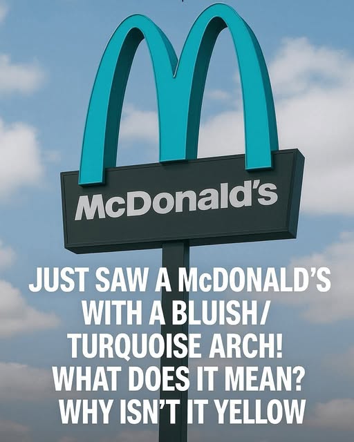
Sedona’s building codes reflect a long-standing philosophy: nothing should visually compete with the natural backdrop. Urban clutter, neon signage, reflective surfaces, or hyper-bright colors aren’t acceptable. What works in Phoenix or Los Angeles doesn’t work there. The red rocks come first, always. So when McDonald’s approached the city with its standard design, the answer was simple — the sign could go up, but not in gold. If the company wanted to operate in Sedona, the arches had to blend into the desert’s earthy tones instead of screaming over them.
After negotiations, the compromise landed on turquoise. It wasn’t just random. Turquoise shows up in Southwestern art, jewelry, and architecture. It fits the region’s culture and sits easily against warm desert colors. The final decision wasn’t about clever branding or an attempt to go viral decades before social media took off. It was about respecting the landscape. And to McDonald’s credit, they went along with it. They didn’t fight for the yellow. They didn’t try to strong-arm the city with corporate stubbornness. They adapted.
What started as a practical concession accidentally turned into something iconic. The turquoise arches quickly became a point of curiosity. Travelers heading into town to check out the hiking trails or vortex sites started pulling over to photograph the unusual sign. It became part of Sedona’s unofficial tour circuit — alongside the Chapel of the Holy Cross and Airport Mesa, you now had “the McDonald’s with the blue arches.” People began posting photos, blogs highlighted it, travel magazines mentioned it, and the location became recognizable far beyond Arizona…
